The Kurokawa Gallery at the Art Institute of Chicago is a unique and unusual setting for an exhibition. As both exhibition space and as a transitional area between the Art Institute’s Modern Wing and the Impressionism Galleries this gallery is a busy thorough-fare populated more by patrons on their way to the popular Caffé Moderno than by those willing to stop and study an exhibit. Many exhibitions would find themselves at a disadvantage placed in such a highly trafficked space, but Project Projects: Test Fit, an exhibition designed by the New York-based graphic design firm Project Projects on display until April 28th, is not like most exhibitions. Using reproductions of objects from the Art Institute’s permanent collection, this exhibition seeks to comment both on the traditional curatorial process and on how museum exhibitions are designed. Rather than suffering from the fact that the majority of visitors will simply glance at a few of the pieces and neglect to read the text in the labels, Project Projects: Test Fit embraces this inevitability and uses it to its advantage. The average visitor will enjoy experiencing Project Projects: Test Fit for its visually striking images while the engaged visitor will appreciate the exhibit for its witty, thought-provoking, and at times poetic label text.
The visitor does not approach the Kurokawa Gallery from the side in a way that would provide an obvious beginning space for the exhibitions housed there; instead, the visitor first sees the middle of the exhibition space. Rather than place the introductory text panel in this middle area directly in front of the opening onto the gallery space the designers chose to immediately confront their visitors with some of the most visually engaging pieces in the exhibition. The view of these images provokes interest and discussion on the part of the visitors whether or not they read the accompanying labels. With the intentional selection of images and design of labels throughout Project Projects: Test Fit, the visitor, whether she engages with the image alone or the image and the label in combination, will invariably be prompted to consider larger issues than simply the aesthetics of the images shown.

While Project Projects: Test Fit has the ability to encourage all visitors to engage in a deeper way with the material on display, the real engagement occurs for those visitors who take the time to read the labels throughout the exhibition. The introductory text of the exhibition is placed in an unlikely position to the left of the gallery entrance where the majority of visitors—utilizing the gallery in its utilitarian function as a hallway rather than as exhibition space—will never read it. While this may initially seem like an oversight on the part of the exhibition designers, I believe it was an intentional decision to allow those visitors who simply want to get from point A to point B to appreciate Project Projects: Test Fit for its visuals and to avoid bombarding them with text they are unlikely to read. Placing the introduction on the side, then, puts it in an area out of the way of these transitional visitors and in a place where the contemplative visitor can engage with it fully with less distraction.
Reading the introductory label informs the visitor that there is more going on in this exhibition than is apparent from the images alone. The label informs its reader that the exhibition provided a means for “investigating the curatorial process and issues related to exhibition design.” In essence, Project Projects: Test Fit is having a conversation with its visitor about how exhibitions are designed and what issues can be or should be discussed in an exhibition. The introductory label gives the visitor this theoretical idea of the purpose of the exhibition, but it is only upon engaging with the images and their accompanying text that the visitor understands exactly how this plays out.
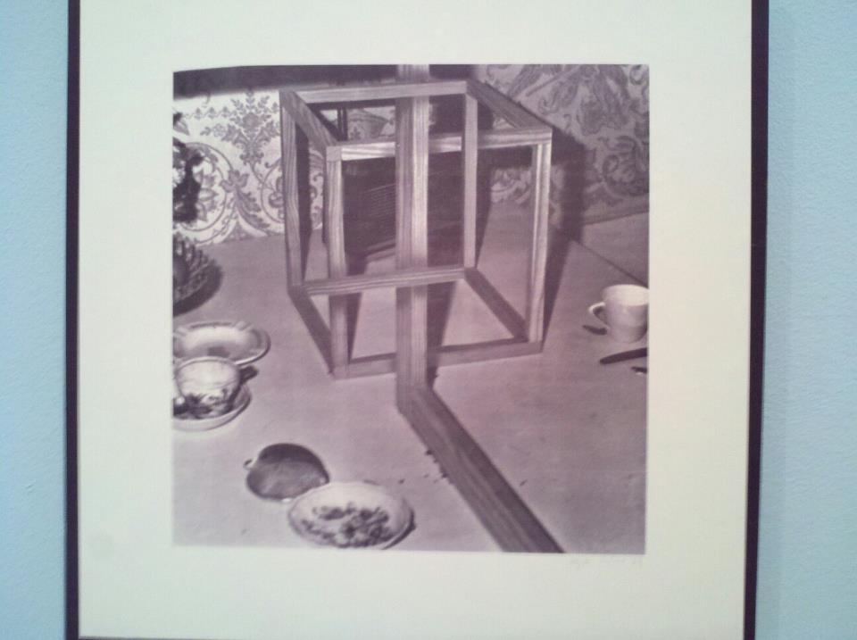
The images themselves are visually appealing and interesting, but it is the labels that are the real high-point of this exhibition. These labels play on the ordinary idea of a museum label with each label providing text that follows the same prescribed format. After providing the “normal” information about the creator, the title of the piece, the date of creation, and its material, the object labels offer interpretation that encourages visitors to engage with and contemplate each piece. The first sentence in this interpretive section provides an explanation of what the image is, but also provides a hint as to possible interpretations of the image and issues that can be addressed. The first sentence for an image titled 9 Objects, for instance, reads “This is a print of a photograph of an impossible construction ensconced in a bourgeois kitchen.”
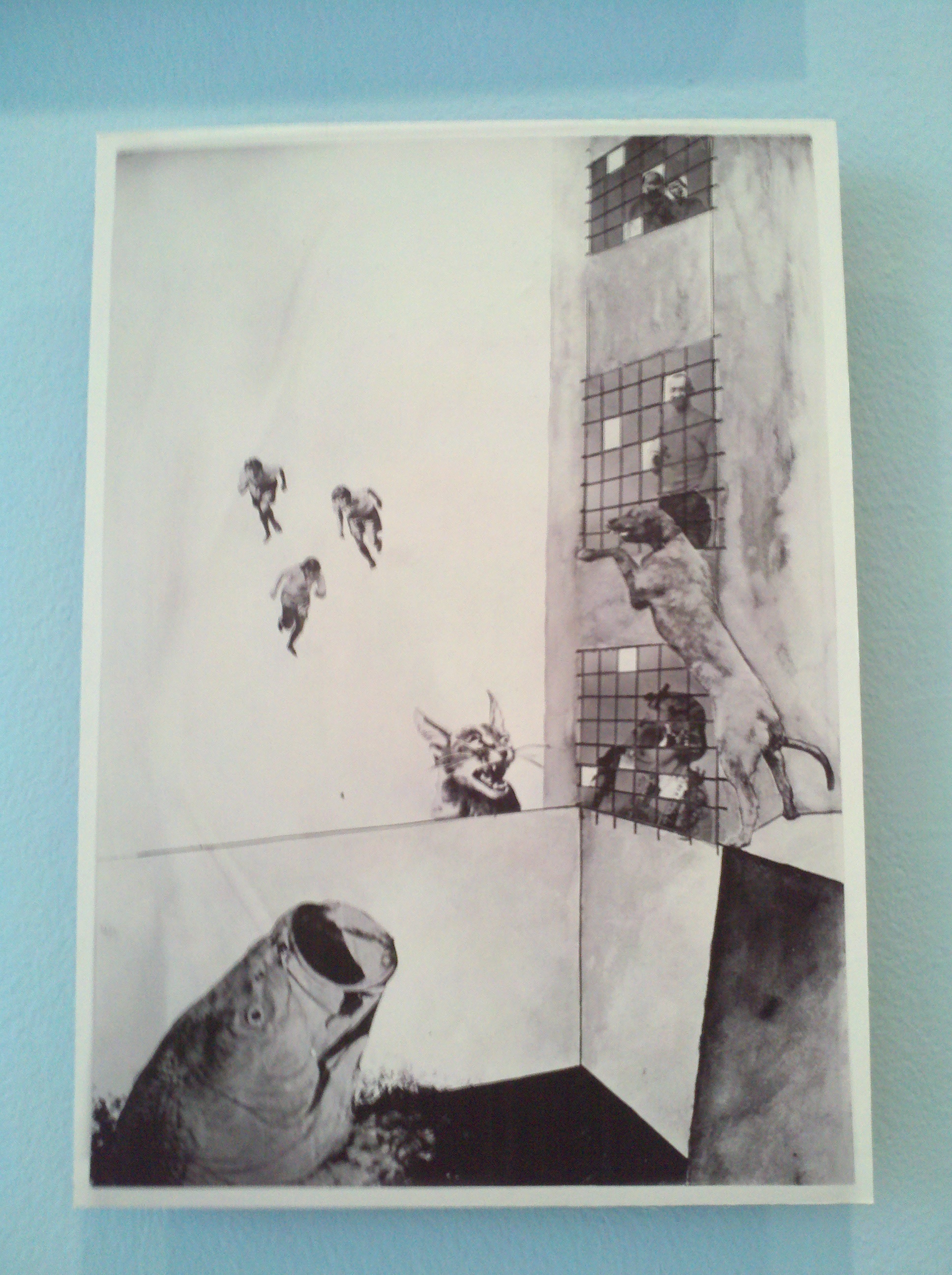
The second sentence in the label format asks a question that is, to some degree, related to the image. The questions here prompt a range of emotions and contemplations from fond reminiscences to issues of the city and even personal failings. Some of the questions asked here include “Where was your last vacation?”, “How does demolition make you feel”, and “What’s the biggest sin you’ve committed this week?” These questions promote engagement with the exhibition in a way that is not often seen in ordinary art museum exhibitions. The third and final portion of each label, unlike the questions which are often playful, prompt the visitor to contemplate more serious and overarching concepts and ideas that can be drown from each image. These sentences can seem beautifully poetic at times, and are both thought-provoking and enjoyable to read. The final sentence for the image The Mavericks II (Die Eigenbrötler II) is a particularly poetic example, it states “The fog comes on little cat feet. It sits looking over harbor and city on silent haunches and then moves on.” Each label provokes a unique emotion within the visitor, encouraging different discussions and an exchange of ideas, whether between the curator and the visitor or between multiple visitors. As a solitary museum-goer, I found myself alternately giggling at the questions asked, racking my brain for the last time I took a vacation, and desperately wishing I had someone with me so that we could discuss the ideas raised by each piece and its text.
Project Projects: Test Fit is an interesting and engaging exhibition for multiple types of visitors. The images from the Art Institute’s permanent collection are visually appealing and enhance the experience of the many visitors who are simply passing through the gallery or who may only have time to stop to glance at one or two individual pieces. For the contemplative visitor with time to study the exhibition, Project Projects: Test Fit provides so much more. Visitors who engage with the visuals and read the accompanying text will benefit from an experience that differs from the quintessential exhibition experience. Rather than simply learning about who created each piece or its materials, the visitor who reads the object labels is invited to have a conversation with the designers, with herself, and with other visitors.

Leave a comment